

Genesis Food Labels and Warning Symbols for Trustwell
Please note that most of my design work with Trustwell cannot be shared in detail. The following is a more high-level overview rather than an in-depth look at each piece of the project by design.
Project Overview
Genesis users at Trustwell need a way to build accurate, legally compliant, custom labels and waring symbols using their existing ingredient and recipe formulations. I’ve spent the last several months owning these designs and scaling the project as Trustwell expands to international markets.

What I’ve been up to for this ongoing project:
Working within an existing framework and applying a design system created by our senior UX/UI designer.
Creating new feature work
Collaborating with our product and regulatory teams to understand the in-depth legal requirements of each government authority including constraints, specs, and necessary outcomes.
Partnering with the development team to work out the sequencing of intricate conversions and calculations within the ingredient, recipe, and label formulation user flow.
Advocating for culturally responsive designs.
Scaling designs to avoid one-off fixes and craft holistic experiences as our company rapidly expands to new markets.
Growing an Existing Label Design
I inherited the label project from our senior designer. He had already mapped out the design patterns and flow for much of the United States and European Union at project hand-off.
I completed his work for US and EU labels and went on to scale the project for Canada, Mexico, and Australia/New Zealand. As the project expanded we (product, regulatory, and me) discovered new requirements based on authority regulations that we couldn’t have anticipated. This challenged me to think flexibly as I developed new patterns that would work in harmony with the existing flows. These new designs have shipped!
Design Overview
The two pages below walk the user through their label setup.
Here the user fills out information such at the title of their label and the country regulations they are building it for.
They select the label option template based on their needs. For example, if the user wants to display nutrition information for cereal they might select Dual Column with a second column that shows the nutrition information when 2% milk is added to the cereal.
Next a setup screen prompts the user with instructions on how to proceed with their label generation.
My Additions
From a design standpoint, I contributed to each additional authority and label as requirements trickled in which included authority icons, information cards, and label sketches. I also contributed to the nutrition labels and user flows:


The next two pages show examples of the label creation flow.
Users select recipe(s) they have previously formulated in Genesis to include in their label.
They move through prompts ranging from display and serving options to nutrient preferences.
As they select their preferences Genesis builds a nutrition label which the user can then preview and download.
Nutrition Label Images:
I rendered precise government labels and warning seals in Figma.
Some governments provided details down to the millimeter while others gave vague scales left up to interpretation.
With the help of the product and regulation team I supplemented government information with real-life examples from different countries to fit user mental models.
Option and Nutrient Flows:
I restructured a bilingual selection option that saved the user clicks.
For Australia/New Zealand I introduced a new pattern so that users could manipulate the order of their custom nutrients.
Much of my work centered around small responsive tweaks. For example, I adjusted from checkboxes, to radio buttons, to drop downs based on the number of selected items.


Cross-Team Collaboration and Feedback for the Win
Of course the best designs don’t happen in solo work. I worked with experts from several different departments, iterated on ideas in design sessions, and implemented feedback throughout the life of my label and warning seals project. And still do! For brevity’s sake I explored an example of collaboration with warning symbols below. Just know it’s always baked into my process.
Researching with the Help of the Regulatory Team
I researched information from international government resources provided by the regulatory team to make sense of requirements and constraints. I consulted with them when I had questions and regularly checked in to make sure I was using culturally responsive phrasing and visuals. For example in the US we say “serving size“ but in the EU it makes more sense to say “portion size.“
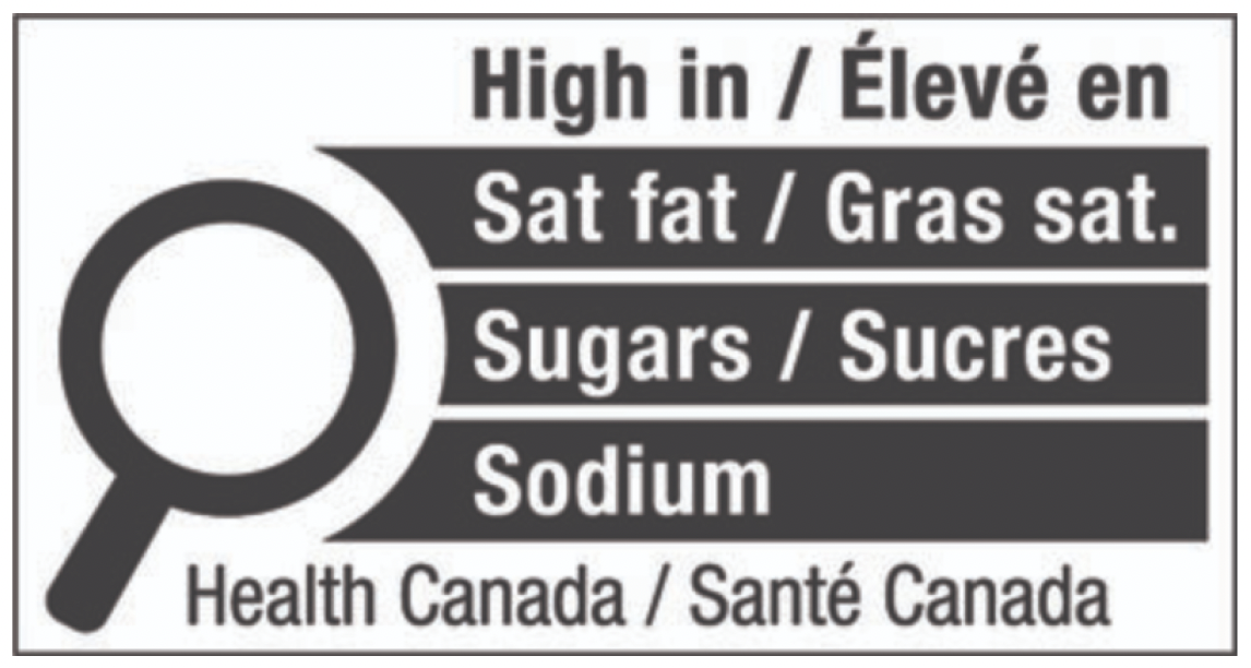
One of the projects I worked on was adding required warning symbols to Mexico and Canada userflows. Below you can see examples of some of the tables I studied to understand what was required. For example, in the Mexico authority, it’s important for the user to be able to enter information so that Genesis can not only understand the weight of nutrients but also identify if the recipe is a liquid or a solid.
Brainstorming and Design Sessions with Product and Engineering
The way our application works, we needed to provide users with generated variations of symbols and give them sizing and style options while their recipes and ingredients were in a draft (unpublished) state.
The problem is that if a user changes any single component of their ingredient, recipe, or serving size it could trigger a different warning symbol for that same recipe.
We needed a simple way to provide users with what they needed while making sure the options were accurate.
The product manager for the project and I hashed out a flow that provided the user with choice but had lots of checks, balances, and warning alerts throughout the process. It was our first best idea and a workable solution.
When we brought it to the design walkthrough engineering asked us questions about our approach and explained a few things we didn’t yet know about behind-the-scenes calculations. This helped us think about the problem in a new way.

I used government-provided specifications to mock up compliant warning symbols. I converted each mock-up to and SVG so that the engineering team could manipulate the sizing (within regulation perameters) without sacrificing the integrity of the spacing ratios. Apologies that the photo quality is a bit fuzzy here. These image examples came straight from government sites.


Clarity After Feedback
The feedback we got from our engineering team helped push us to a better solution.
Based on all of this collaboration and partnership I was able to eliminate steps in the workflow and accommodate new requirements without sacrificing the integrity and simplicity of the user workflow.
When all was said and done the user had one additional toggle switch for Mexico and a new option to preview and download their warning symbols. The rest of the heavy lifting was taken care of by our engineering team (thank you engineers!) thanks to a group effort to consider where certain calculations needed to be inserted in the user flow.
The collaboration process enabled me to:
Understand the constraints and legal requirements of the project.
Gain invaluable feedback and knowledge about areas outside of my expertise.
Move beyond the best first solution to the best solution.
Ultimately take the burden off the users while giving them all the choice and information necessary.
Things I Would Have Done Differently
One of my biggest goals for my own work process is to lobby for the opportunity to incorporate more user research.
Our company moves very quickly and our users are in the process of migrating from an old platform to a new cloud-based platform. Between a need to rapidly ship new features and a lack of access to users, our product department that sets the scope for projects is not able to include baseline KPIs, user discovery, user interviews, or user testing/validation into the design process or allow for the UX department to tackle it on most projects. We have discussed the need for it, its benefits, and the shared aspiration for implementing user research. Nonetheless, progress is slow.
In a dream world where I get to set the scope, I would:
Gather baseline information before the new design is started like: who uses these features/what are their goals, how long does it take users to move through the existing user flow, what are the existing pain points?
Run usability tests of the prototype before it is handed off to developers - ideally with real people from target authority user groups to uncover our own cultural blindspots.
Actionable next steps:
Advocate for earlier collaboration across teams. Currently, we only conduct high-fidelity design reviews. By creating low or mid-fidelity designs and discussing our concepts with the engineering team earlier we would have saved time and gotten to our better idea faster.
Push to monitor user interaction after designs are released to learn what we can continue to improve. I’ve already communicated this to our product team and they invited me to Pendo to monitor user metrics which is a good first step.